Koufu Eat —

Optimizing the Food Ordering Experience

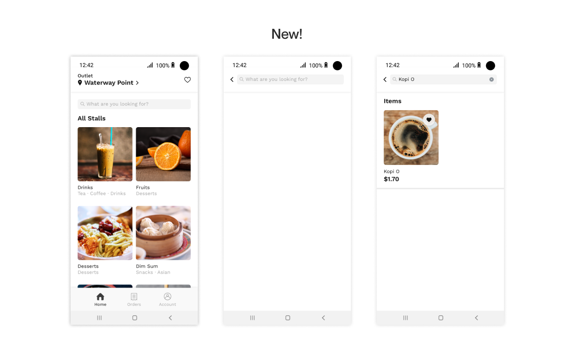
As a frequent diner at the Koufu food court, I took this on as a personal case study to tackle some common frustrations, to create a better experience for users. The result is a streamlined experience that lets users browse the menu better, and place their order faster.

Disclaimer: This is completed as a personal case study. I am in no way affliated with Koufu.

Role

Research, UX Design, UI Design

Team

-

Timeline

May 2020

01

Problem Statement

Browsing and ordering through the Koufu App is a frustrating and inefficient process for users.

How can we make the app simple, delightful, and easy for diners to use?

02

Understand and Analyze

What keeps users from using Koufu Eat?

I interviewed 5 random individuals — 3 of whom have used the app before, and 2 new to the app. The interview was conducted in 2 parts:

(1) Observing the users as they interact with the app to order their food, and
(2) User interview to dive deeper into their thoughts and feelings.

Some of the questions asked:

How did you find the overall experience of completing this task?

Is there anything that caused you frustration while completing the task?

How often do you use the app?

What motivates you to use this app?

What keeps you from using this app?

I also looked at past reviews on the Play Store. Many of the issues brought up were similar to the interviewees' sentiments.

Here are the key findings:

Browsing and ordering is inefficient and frustrating

From needing to choosing their outlet manually, to not getting their orders confirmed automatically, users get increasingly frustrated and impatient with using the app.

Menu visuals and details are lacking and unclear

Small, pixellated visuals with no explainer text - especially difficult to interpret for international cuisine.

Unintuitive navigation

Hamburger menu mixes frequented tabs amongst all tabs. It requires additional clicks and adds to users’ cognitive loads.

Lack of customization options

Customization options provided are not extensive, and users are unable to add in special instructions for their order.

03

Customer Journey Map

04

Task Flow

(A) Default

(B) Re-ordering from history

05

Wireframing & Prototyping

06

Final Design — Highlights

An efficient browsing & ordering experience

Auto-Detection of Current Location

The app can automatically detect their location and select the nearest stall, removing the need for users to manually scroll and find their desired outlet (from an alphabetical list).

Direct search

Users who know what they want to order can search directly for it, instead of navigating through through different layers.

Favourites

Users are able to shortlist items to easily access them in the future.

Re-order

By adopting a bottom navigation bar, the function to re-order from past orders is much more visible and straightforward for users.

With a menu designed for clarity and practicality

More Emphasis on Photos

Instead of being text-heavy, we use larger and clearer photos to allow users to browse through menu options easily.

Stall Tags + Item Descriptions

Tags help users to easily filter out cuisines, flavours and dietary requirements. Short descriptions accompany photos to help the user have a better understanding of what they are ordering.

Customisation

Users can select from a wider range of general customisation options, and input specific requests (e.g. to cater to food allergies).

A streamlined checkout process

Default Payment Method

Automatically selecting the last used payment method reduces the hassle of manually selecting their desired payment method and details every time they check out their order.

Clean and intuitive navigation shortcuts

Bottom Navigation Bar

A bottom navigation bar provides a quicker way of navigation.

Home — Browse through the menu and place orders.

Orders — Keep track of current orders and view old orders.

Account — All other miscellaneous information such as personal details, payment methods, and support can be accessed from here.

07

User Validation

I invited 5 people to interact with the prototype and compare it to the existing app.

5/5 users thought the stalls and menu were much clearer to understand with the revised visuals and information hierarchy.

4/5 users said that the prototype felt significantly easier and faster to browse and order food.

5/5 users thought the auto-detection of location and search function were very helpful.

07

Key Learnings

Designing a good O2O experience is much more than just the app

As a personal case study, I limited the scope to making improvements within the app. On hindsight, what I would have done differently is to expand it to account for many other factors - systemic, service, risk - that affect the O2O dining experience.

Putting UX into practice in an end-to-end workflow

As my first UX-focused project/case study, I had humble learning goals: practicing a user-first mindset in the real world, learning and applying UX frameworks, and getting the hang of industry-standard design tools.